A New Flag for Edmonton
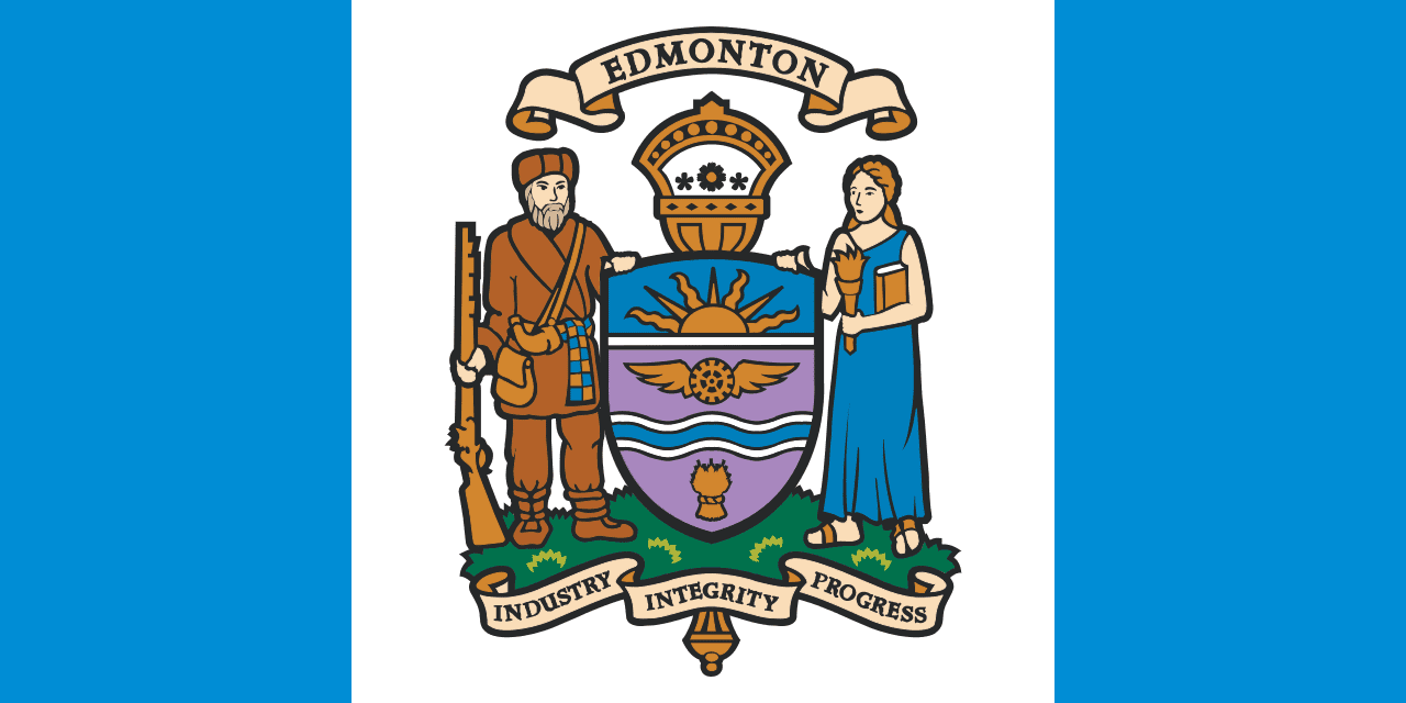
If you’re not familiar with Edmonton’s current flag, don’t worry – most people aren’t.
Here’s what it looks like:
At Council today I put forward a motion asking city staff to collect public input on our current flag, as well as specifically collect feedback on Ryan McCourt’s flag design, presented by the Confederacy of Treaty 6 First Nations at Treaty recognition Day at City Hall. Here’s Ryan’s flag design:
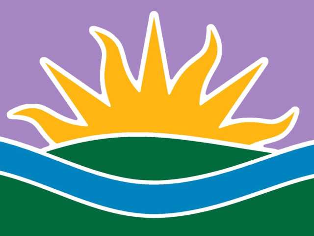
Ryan’s flag was part of an art contest adjudicated by First Nations leaders on the theme of Treaty 6 day, a design that is drawn from the text of the treaty, which reminds Settlers and First Nations beneficiaries that the Treaty is not time-limited, but enduring “as long as the sun shines, as long as the grass grows, and as long as the river flows.”
Though I love the symbolism of our current flag, its design has been often critiqued. When we turned a crest into a flag, we sacrificed readability and simplicity. There was an excellent TED talk about flag design from a few years ago that uncorked a continuing discussion in Edmonton about updating this important symbol of our city. In this talk, Mr. Mars suggests there are five basic symbols of good flag design:
- Keep it Simple.
- Use Meaningful Symbolism.
- Use Two or Three Basic Colours.
- No Lettering or Seals/Coats of Arms.
- Be Distinctive.
It’s fair to say our current flag design doesn’t exactly check many of these boxes.
It’s important to note that I am not suggesting that we change the city’s crest, which is rich in meaning and symbolism. In fact, it’s one of my favourite features when I’m touring guests around City Hall.
But the flag serves a different purpose in the life of a city.
My motion is meant to get the conversation going about what’s right for our city, and I’m not presuming the outcome. I’d like to hear from people on their views on the current flag and their views on Mr. McCourt’s flag. His design represents an important kind of symbolism: Reconciliation with First Nations, Metis and Inuit Canadians. Edmonton is leading a national conversation about reconciliation, and reassessing the symbols we use to represent ourselves is part of that journey.
For background, I asked Ryan to share some insights into his concept, starting with the purple sky:
“1. Generally, the colour purple traditionally symbolizes courage and authority.
- A purple sky (along with a rising sun) represents the dazzling auroral light that signals a new day dawning, symbolizing positive beginnings and bright futures.
- The purple colour (along with the whole colour scheme of the flag) is carried over directly from Edmonton’s current flag, as seen in the mostly-purple escutcheon (shield) of the City of Edmonton coat of arms. This shared colour scheme serves as an element of clear continuity between the current flag and the proposed new design.
- The flag design also shares the traditional colour palette of Edmonton’s official City Tartan, which specifically includes purple as one of Edmonton’s official colours.
It’s important to to be respectful of the continuity of distinctive traditional elements and colours when attempting to redesign heritage symbols like a civic flag, so I’ve taken my cues from the existing official symbolism entirely.”

Ryan’s design observes the design principles Mr. Mars outlined in his TED Talk, and its symbolism is important. But I think it’s time we talked about our flag, and I’m interested to know what you think.
The current city flag is not inclusive. Go with Ryan’s.
I agree that the old flag is dated, however I would like to see Edmonton, Industry, Integrity and Progress incorporated into the new design.
Where’s the first Nations included in this I wonder. Your on treaty 6 land. Get your head out of your ass and start recognizing your real origins history. Signed maskwacis.Ab
I was a bit worried when I saw this pop up on your twitter feed but clicked it to see what your thoughts were. I’m glad that I did because the design of Ryan McCourt’s flag really appeals to me. I love the meaning in it and think it brings our flag into a modern time. My vote is to definitely adapt the new design, I think it looks superb!
I agree, an update on our flag is a great idea! Ryan’s design has a lot of great elements, and I do like how it integrates existing symbolism from our current flag. I feel like it has one too many colours though (my vote would be axe the green). I like the purple (how many flags have purple on them?), but I think there’s too much of it in his design. It would work better for trimming or detailing, not as the main colour on the flag. My favourite aspect is the river band. I would love to keep the blue border from our current flag. I think it nicely meshes with the national flag, and is a good reference to Lester B. Pearson’s proposal for the national flag.
The new flag design contains elements of the City crest, so I like that about it. I would like to see other suggested designs.
My first impression of the flag was, where is the city name. The flag meets the suggested requirements, but if I saw this flag on a pole I would not know what it represented. I think it needs Edmonton on it. I will need more time to develop my second impression.
I like this proposed flag! I watched that TED really and thought the same thing
What a waste of time and money for something that no one even cares about. When was the last time someone “critiqued” our civic flag, Don?
I’m definitely not in favor of the proposed design. It says nothing about our city, our people , or what we stand for – it could be anywhere…. if we’re going to update the flag it should reflect Edmonton specifically. (Rising sun and a river could be Calgary, Saskatoon, Red Deer, Lethbridge… anywhere)
Yes please waste time and money talking about something no one cares about. I’d rather see you discuss how were going to make back some of the money we wasted on the arena.
Edmonton has the ugliest flag I’ve ever seen. I, for one, am happy that we’re changing it. It has the sun (big sky country) and the river. We don’t need the mace and wheat and a rotor with wings and all that crap. Finally getting rid of that embarrassment!
I really like and appreciate the design considerations in this flag and using the crest from our current flag as inspiration. The prominent purple is striking and unique, the rest of the colours we can learn to identify with—just as we get used to new buildings and structures riseing in our cityscape.
I also value the incorporation of treaty 6 into the flag and am reminded of the flag created a few years back which depicted edmonton as the gateway to the north with fields of white surrounding a star.
But the purple flag s pretty pretty great and I’d be proud to have any flag with considered and identifiable design.
It looks like a kid’s drawing, no thanks. Doesn’t the council have real issues to deal with?
Keep the current flag… It’s way way better and very Edmonton!
You are well on your way to being ex-mayor. The waste of time and money on idiotic things like this, instead of effectively governing and being a responsible steward of the taxpayers’ money and priorities, will be your undoing. The fiascos under your watch like the 102 Avenue bridge construction, Walterdale Bridge construction, Metro Line LRT, Valley Line LRT (and others) should be criminally investigated. Note the word CRIMINALLY.
Take a break from hugging trees, and dreaming up ways to make navigating this city more difficult and expensive. Remember who pays for the roads, bridges, hospitals, schools, etc.: TAX-PAYING, WORKING PEOPLE WHO DRIVE CARS. DEAL WITH IT.
I love the idea but I do not like this design. The flag does not have many uniquely Edmonton features. I also do not like how most of the flag redesigns that I’ve seen online keep trying to put an image of the city into flag form. Our skyscrapers or our river do not define us. Everyone has skyscrapers and a river. I really want to believe the people here are more important than the location they inhabit. We need something more symbolic of us as a whole. Edmonton has always been a gateway city, maybe something that involves that, our home but also the home for everyone that comes through, maybe that’s not something to be ashamed of but rather embrace.
This looks like a decorative flag at an amusement park. The color scheme is too bright and festival-y. I’d think it was put up as part of a theme for some event rather than being indicative of the city if I saw that.
I support the idea of updating the flag but keeping the old seal. The proposed design is fine and I like the idea of continuity but would love something bolder that speaks to the Edmonton being built along the North Saskatchewan on a very ancient history of visitors, hunters, traders until the diverse and million person city we see today. I prefer the blue borders with a black beaked magpie and blue/purple plumage. I think it speaks to the cleaverness and industriousness of Edmontonians over the ages and in to the future. I do like referencing the treaty we each share… “as long as the sun shines and the river flows”, etc. I could get behind that too.
Once again the city is considering giving our heritage a kick in the rear and booting it out the door. Stop thinking you need to change things. K-days is a prime example of thinking change is needed. The current flag is fine, stop wasting money on this type of thing on focus on important issues like getting the snow off our streets. This huggy kissy crap isn’t important.
What a waste of time ! it gives the impression that this council has nothing better to do then waste tax dollars on frivolous things.
When is this council going to act like learned individuals instead of coming up with these hair brain ideas? there are more urgent matters like inner structure ( i e: roads, sewer and street lighting).
I think this is a great design. It incorporates our beautiful sunny days, our beautiful parks and river valley and the purple sunsets we often see all year round. Good job. I would want to see this flag everywhere in Edmonton. Just like Chicago. Please change it and fly it.
Leave the flag alone. The new proposal is horrible.
Really big fan of changing the flag and I’d be perfectly happy with Ryan’s version being adopted over the current flag.
But I must say that I feel the proposal does have minor issues I’m a not a fan of: waay too many wavy lines for a flag, green and purple are poor complements to eachother, and frankly the depiction of the river valley is too literal.
Why not just go all out on taking inspiration from the coat of arms’ crest?
Something like this: http://i.imgur.com/S5zT3bj.jpg
Yes rather old flag seems outdated, but the new flag is ridiculous. Edmonton goes from the city of Champions to zeros and I guess the new flag reflects that.
I agree that our flag needs updating and I think it is an important issue. As our community progresses, the importance of knowing our identity and having symbols to represent this gives us a sense of belonging which is an essential need for people. It is especially important for our Indigenous community as we go through this time of action towards reconciliation. I think the new design is a good start. I like the comment suggesting a symbol recognizing Edmonton as a gateway. Throughout the world Edmonton has a reputation of being a friendly and open community and I think those qualities are timeless and a primary piece of our city’s identity. I think the yellow tone should be more golden as in our current flag. I also wonder if there is anything we could use to symbolize the fact that we are a capital city? A star perhaps?
Regardless of what the reasoning is behind the redesign of the flag – there are going to be those who love it, those who see no need for it, and those who don’t like. That being said, I do like the simplicity of it. After reading what everything means, it makes sense – clearly. Do I agree with those who posted saying that it does not depict Edmonton… to a degree. But our city is ever changing, and those are things (that are in the flag) are constant. The economy, our diversity, and everything else is changing. Essentially what I enjoy the most is the simplicity, the beautiful sky to represent the northern lights, our river, our grass and the beautiful sun we are blessed with for most of the year. Those are most definitely things that many Canadians cannot say they get to have but, living in Edmonton, we do.
This seems to be a PR item and not something that our mayor or councilors should be debating when there are more pressing issues to deal with. This topic can be added to the list of other wasted or mismanaged costs we have incurred by our elected officials. Think of the bike lanes, funicular, LRT, multiple bridges, poor road maintenance. Time for our elected officials to actually work to improve the city and manage funds appropriately.
I would use the lettering and the crest and the blue bars then get rid of everything else.
Love the new design. It is simple but still conveys, to me at least, a sense of wonder and pride for this ‘festival city’ that is my home.
Our city is home to Folk Fest, Dreamspeakers Film Festival, Jazz Fest, Ice on Whyte, Interstellar Rodeo, The Works and the oldest and largest Fringe Theatre Festival in North America (to name a few) and deserves a flag that represents our geography, history and love of the arts. This new design manages all three quite nicely.
No fur trading, no City of Edmonton. Our HBC fort/fur trading history should be represented in some way on the flag.
We need the name Edmonton on it.
We Don’t Need a New Flag!
The original flag is the best flag. What better to put on the City of Edmonton flag than the City of Edmonton crest?
The new proposed design (Ryan’s flag) is ugly and does not have any significance to the City of Edmonton. A sun, a hill, a river, and sky are so generic and could be used by any city that has a river running through it. This is a joke.
City of Edmonton is recognized by 2 things, our flag and our former slogan, City of Champions (bring it back). No one is going to associate this proposed flag with the City of Edmonton.
Really? THIS is the biggest problem the city has to deal with? Instead of wasting our money and your time hows about we work on streets full of potholes, LRT crossings that are still nightmares and so many other issues that actually are important to this city. Everytime you do something like this I wonder what piece of stupidity you are trying to draw our attention away from!
That’s based on design rules of today, and not the traditional origins/rules of flags. We should take pride in the fact that we have a city crest on our flag, a symbol people also wouldn’t know if it weren’t flying throughout the city.
In the attempt to make every possible decision to Treaty 6, it completely negates the multiculturalism and historic ties this nation and city was created upon. Changing the flag may not be the best way to honour treaty 6 for that reason of excluding everyone else in the process. Perhaps renaming the River Valley, our most prized possession, to Amiskwaciwâskahikan Valley is a better salute to our Native and Metis community. That National Aboriginal museum conversion is also a great thing. We could ADD to the street names like St Albert and KEEP both historic and aboriginal references by having Anglo-Franco names AND Aboriginal names on our streets.
Based on your 5 points, here’s why we should actually keep our current flag.
Keep it Simple. – Our current flag is simple. City crest bordered by blue like the borders of the Canadian flag.
Use Meaningful Symbolism – No new proposed design is more well thought out and meticulous in symbolism tells the history of Edmonton than the coat of arms.
Use Two or Three Basic Colours – A modern minimalist design rule which shouldn’t apply to flags and their long history and tradition.
No Lettering or Seals/Coats of Arms – Again, same thing in regards to traditional flag rules and how they were originally intended. A flag and city crest shouldn’t be limited to design rules today. If it were, then the flag would need changing every decade to adhere to every generation of designers hereafter.
Distinctive – Our current flag is distinctive and covers the quoted elements of the proposed flag, and more.
How about also explaining all the elements of the current City of Edmonton flag and crest? Wikipedia has a better explanation of it than the city website. Educating people about the current flag/crest (including in this blog post) would make them aware of Edmonton’s industry, history, and physical features, and also develop an appreciation for it.
https://en.wikipedia.org/wiki/Coat_of_arms_of_Edmonton
Waste of time, money and resources. Focus on essentials first and stop planning your exit legacy like your self-serving predecessor.
I really like the new flag design.. simple, memorable, unique.
pretty easy for school kids to draw/color in school as well.
I like the idea of a new flag but get Junior High and High Schools to have a competition to design a new one
Though I strongly feel that an Edmonton flag must reference our indigenous culture, I’m not a fan of Ryan’s flag. Though it doesn’t use lettering or seals, it’s (1) too complicated, (2) very literal and not symbolic in the least, (3) uses too many colors. That’s a score of 1/4 on Mr.Mars’ checklist.
I’d love to see a flag redesign and a community/placemaking initiative. It need not cost much (or anything) and can be put out for discussion.
There is nothing wrong with the old flag other than the man and woman are dated.
The new flag is absolute garbage and isn’t inclusive of anyone.
I am tired of aboriginals going on about their land. Studies have proven they immigrated across the Bering sea from Asia. So they are immigrants here too.
BTW my great grandmother was Mohawk.
Edmonton was founded by the indigenous people? Indigenous people are the only ones who made it grow and prosper? Indigenous people are the only ones who live here and matter now? Why are you wanting to fly an indigenous flag? Are we erasing our history because theirs is more important?
I’m absolutely in favour of our flag referencing the indigenous cultures of the region however I feel it should also have some references to the pioneers who came to this land to start a new life and who helped build this city. The old flag does that well but it does need to be redesigned.
Yes we need a new flag. But no the suggested design is too complicated and does not represent Edmonton as a whole or muchof Edmonton at all. With out being told what it means it looks a lot like BC provincial flag.
Stop! There are priorities in this city right now and I think the mayor and city council should buckle down and get some of the real issues dealt with. We are left with very little tradition or anything with character in this city because a group of innovators want to change everything. No one believe this will not cost tax payers in some way or another. We are a city with a history and there is so little left that reflects any of that which is very sad. Change isn’t always necessary just for change sake. Don Iveson please just work on getting our roads fixed, working on some cost savings for taxpayers (mine have doubled in the fifteen years I have lived in my home and there are no improvements in my district). If my comment is not relevant reread Bell’s – succinct and to the point!
Why does everything have to be changed? Our city may be changing, but our heritage should be left alone. What is wrong with having the city crest on our flag? Leave the flag the way it is. The new flag design reminds me of the flags that we see lining the roadways, advertising an event. There isn’t anything on it to say it is the City of Edmonton. We need our City of Champions signage back, because we ARE a city of Champions. K-Days isn’t the same anymore. Focus on the problems, that are more important to the citizens of Edmonton. We really need to get the LRT problems sorted out. Sidewalks and roads are in such disrepair, heaving, during the winter months, causing falls for seniors and small children. The pothole problem comes back every year. Is there no way to fix them once and for all? Top coating the streets does nothing, they just crack up in the spring and are worse. We want safer communities. Our community leagues are closing down one by one. We put so much of our taxes into “re-doing” things, instead of looking at the real problems, the homeless, seniors, people who have to survive on Food Banks. We could renovate some of the old school buildings, into apartments for the homeless, or into senior housing, like North Edmonton Elementary School. Our taxes and utilities are getting to the point where seniors can’t afford to pay them anymore, and are giving up their homes. Deferring tax payments is not an option.
Why would we change our flag? It is who we were and who we are. The proposed new flag looks like an elementary school project. No history, no pride, just pretty colours.
All these comments, I’m surprised nobody has made a “Purple City” reference yet (but maybe I’m showing my age, and kids don’t do that anymore).
Really great to read all the positive feedback and thoughtful commentary here.
Please, please, please…. do NOT change the flag. What is wrong with history and historical items with this city? Always trying to get rid of history. Leave the flag alone. This suggested new ‘flag’ is more like a logo. E.g. The province has a logo and a flag, and it just so happens that our provincial flag has a crest on it too. I suppose you, the mayorm also feel that it also is too difficult to draw as well.
Instead, why don’t you spend your elected time (and thus the people’s money) on more important things like hiring more police officers or fire fighters or teachers that will benefit the future of the city more directly.
our roads are in bad need of repair and you are concerned about a flag?????
The current flag design is much better than the proposed change.
Hello i am deaf and citizen city of Edmonton for 4 decades . I rather prefer to stick with original Edmonton flag than changing into new flag. People wouldn’t recognize new flag . People would recognize original Edmonton flag . Because it represents ” United we stand in city of Edmonton” a men and lady together with crest . New flag represents nothing but toddlers color . I rather keep it formal and simple . You should make a specific anniversary for original Edmonton flag . Thank you .
Ryan’s submission has too many colours and is too complex with its many lines and shapes.
The dominant symbol, the sun, is not original or unique, it is similar to the Smithsonian sun which is trademarked in Canada and is widely used around the world.
The image is not distinctive or recognizable as Edmontonian, it is too generic, and lacks a feature that gives a memorable connection to Edmonton.
So, although a valiant effort, other submissions including those that honour Treaty 6, First Nations and the rest of our great city should be given equal consideration and feedback.
Unfortunately this looks like a fait accompli.
Others should have the freedom to submit ideas for public feedback, particularly as we remember what Canada stands for today. If we are going to do this, let’s get it right.
If you want a flag that will be embraced, make it bold, visible from a distance, and most importantly,
Make it something a young child can draw. If kids can embrace the flag at a young age maybe they can embrace the city in the same way when they grow up.
I loved drawing our Canadian maple leaf when I was a kid.
Looks to much like the B.C. flag.
I like the idea of changing the flag, as the old one looks dated.
I like the idea of incorporating the river. Maybe something with the AB provincial flag included.
Sad you would even consider changing the flag. The current flag represented Edmonton at the time , history should not be changed. We would not consider renaming Fort Edmonton or changing its theme. Why would the mayor even consider a change.
The proposed design looks like a child’s drawing.
Absolute waste of time and money,- more important issues to deal with. No one I have mentioned this to even knew we had a flag.
This flag design is meaningless. It is bland and generic and does not represent anything. Looks like the BC provincial flag. The old flag is a fine representation of Edmonton and should be kept as is. Stop re-doing everything – we are losing our heritage with this continued tear-down and replace mindset. The time and money that the elected representatives of Edmonton have spent on this absurd venture continues to show the waste of tax dollars. Stop raising our taxes while telling us it’s only a “small” increase every year and then wasting time and money on a silly flag design. The endless tax and utilities increases are so burdensome that citizens cannot afford to pay taxes anymore.
Always out with the old in with the new! Why would we want to change our flag that has been with us through all our city has been through. I think if this happens it just goes to show we really have become a throw away society. Our flag is part of our history, do we throw that away also? Shirley
Honestly I think the old flag is fine. Besides I don’t like the new one. Doesn’t look like a coty flag to me. More like a child’s drawing. Also does the city councils have nothing better to do with it’s time? I feel that there are more important issues to be spending tax payers dollars on than redoing a flag that doesn’t need to be done. It’s the whole city of champions thing all over again.
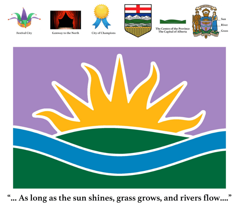
A few more notes on the symbolism of this flag, not covered in the Mayor’s post above:
The Sun Shines…: At the summer solstice, Edmonton receives seventeen hours and three minutes of daylight, with an hour and forty-six minutes of ‘civil twilight’. On average Edmonton receives 2,299 hours of bright sunshine per year and is one of Canada’s sunniest cities. That’s why there is a sun on our city Crest, and on this flag design, too. A rising sun is a symbol of new beginnings and bright futures. As with the city Crest, this rising sun has seven rays, which may be seen to correspond to Edmonton’s 7 geographic sectors – a mature area sector, which includes neighbourhoods that were essentially built out prior to 1970, and 6 surrounding suburban sectors.
The sun symbol can also represent the shine of gold over in “them thar’ hills”, in a reference to Edmonton’s status as ‘Gateway to the North’, or the symbol can be seen as a “Shining City on a Hill” in reference to our significance as a place of educational and political leadership. Or, it can abstractly represent the sights and sounds of a raucous festival happening in one of our parks, or literally as a jester’s cap, in reference to our famous Fringe and our ‘Festival City’. Or, the sun can represent, together with the river, the proverbial gold medal and blue ribbon of excellence that symbolizes our “City of Champions.”
The Grass Grows…: Aboriginal inhabitants settled in the area that is now Edmonton around 3,000 BC and perhaps as early as 12,000 BC, when an ice-free corridor opened as the last glacial period ended, and timber, water, and wildlife became available in the region. The terrain in and around Edmonton is generally flat to gently rolling, with ravines and deep river valleys, such as the North Saskatchewan River valley. The green hills in this design are borrowed from the centre of Alberta’s coat of arms, as a symbolic reference to Edmonton’s central Albertan location and importance as the provincial capital. The colour green in general is symbolic of the importance of the natural environment and agriculture throughout Edmonton’s history.
The River Flows…: In 1754, Anthony Henday, an explorer for the Hudson’s Bay Company, may have been the first European to enter the Edmonton area. His expeditions across the Canadian Prairies were mainly to seek contact with the aboriginal population for establishing the fur trade. By 1795, Fort Edmonton was established on the river’s north bank as a major trading post for the Hudson’s Bay Company. The river was a primary source of sustenance, protection, transportation, recreation, etc. in the past, and now. The blue river trimmed in white is taken directly from Edmonton’s Crest, and placed neatly between the green hills taken from Alberta’s crest.
Seen all together, the flag presents an image of the four elements united in harmony: earth, water, fire, and air. The carefully considered layering of multiple meanings and symbols means the flag can be inclusive of all of Edmonton’s diverse cultures and viewpoints.
I hope this helps people understand the symbolism a little more clearly and how it is all appropriate and distinctive to Edmonton.
I do agree that our flag needs to be updated, however, not a fan of the new design. An earlier comment mentioned it looks like an amusement park flag, and that it does. Look at Calgary, Ottawa and Toronto. Those are great examples of city flag designs. If we’re going to update the flag, let’s choose a better design. If we’re trying to rebrand our city and look to the future, take out the pieces of the old flag and actually rebrand. I understand the original artist was trying to incorporate aspects of the old but it doesn’t work.
If changing the flag is an option, why not get other submissions and have the city vote?
I think our existing flag is too dated and does not represent who we are. The suggested flag is nice, but does not quite represent all of Edmonton. We are the provincial capital and a winter city with a vibrant, entrepreneurial population . I think the flag should include those things.
What a waste of time and money. Most people didn’t know we had a flag. I like the old one. In fact, its hanging proudly in my basement. Why not just leave it alone, Don?
Love the new design. Very cheerful and uplifting. It represents never ending love and understanding.
The old flag does not embrace Edmonton’s cultural diversity. I think it is time for a new flag and Ryan’s design is quite good.
This new flag design is terrible, which is why I wasn’t surprised in the least that it came from Don Iveson. A flag should capture the essence of the City it is supposed to represent. The current (and for some reason) only flag design being proposed is too bland and cartoonish. It could be the flag of any city. Here’s an idea Mayor Iveson: how about you hold a flag competition, where people submit multiple designs and the public can choose which one they like. However, I question whether a competition run by our illustrious mayor will be fair or not; for once Darryl Katz enters the design “Hunter the Lynx” on an orange background the competition will be over.
i like the new flag, brighter, lighter, more modern
he did a great job of updating and keeping it simple
New design looks too much like a child’s drawing and is roo busy
Enough all ready, you dummies can’t seem to let a week go by without trying to waste our money, that’s right OUR MONEY, or should I say your BOSSES money on more of your prog tripe. How about spending it on redesigning a couple of intersections to mitigate the future traffic jams you’re going to create with your idiotic south side LRT routes.
Absolutely NO changes.
Please spent our time and money on issues that matter. May create a program that presents the flag and our heritage better.
Stop wasting our intelligence.
Please leave it alone. There are so many bigger issues and the cost to change things could be used for many things i.e. homeless shelters, roads, etc.
Not this one. Too Simpsonesque / cartoonish.
Why are we always changing things? There is history to the current flag and it needs to be recognized. Are there not any more pressing issues for you and council to address??? This proposed design looks like it is something that originated at a midway… leave the flag alone and address matters that actually matter to the average citizen.
The flag is archaic, no doubt. In it’s youth, the City of Edmonton tore down beautiful, but archaic buildings, in the name of progress. Yet there is value in preserving the past. I would keep the current flag. If it is decided to have a new flag, then this is not the way to do it. I am concerned that our Mayor is beginning to have an unhealthy fascination with all things aboriginal. There is much more to Edmonton culture and history than First Nations. Any change of flag should be chosen from a competition that includes participants from all cultures and walks of life in the City.
The existing flag is excellent. Please Leave existing flag in place. New flag looks very plain and should not be used.
Why do we need a new flag? Are the majority of Edmontonians even aware that we have a flag to begin with? This is a large waste of money and resources that we are paying for – I would much rather see efforts get put back into work that will actually improve the city. While I agree our current flag is somewhat dated, I do not believe that we need to waste resources rebranding a flag, and if we did, why wouldn’t we utilize people in the design industry to help achieve a more modern flag?
I think the new proposed flag design is quite frankly … awful. The new design doesn’t utilize our crest, or have anything in it that represents Edmonton and ONLY Edmonton. The design looks like a child drew it with crayons; it is overtly cartoon based, and requires a lot of knowledge of the “symbolism” that the artist is using. It bears no significance to this city – it is generic and bland in nature (it could be used for almost any city with a river!), and the colors are just awful.
Final verdict? The proposed design is awful, and this whole “remaking the flag” is huge waste of taxpayers money. Why don’t you use this money to better plan the LRT lines so they don’t mess up traffic more than they already have?
A new City flag. Really? This should be a non issue in these economic times. Some of our citizens are going hungry and you’re considering a new flag.
As for the design…Ryan McCourt should stick to chasing ambulances.
Both options are ugly. If you want a good flag, hire a design/branding company and don’t do public polling, because the “wisdom of the masses” doesn’t apply when it comes to design.
So I’m assuming that the LRT is running on time and the construction schedules are all within acceptable time limits and budget debates are done for the year. Why are you wasting time on such pointless fluff dressed up in such a generic design? It’s interesting that this is the only choice of design, if you’re going to waste money on something so pointless, it seems odd that it wasn’t opened up to all 6-year-olds.
In all seriousness, if this is the kind of stuff that you are wasting taxpayer money on, clearly there isn’t enough for you to do, maybe we could benefit from bumping your office down to 3/4 time.
We already have a flag! So some individual doesn’t like the old one. Well I don’t like the new one. Why do we continue to look for change just because some ONE doesn’t like the old one? Not every thing needs change. Sometimes old is good.
Mr. Mayor, are you sure you folks in City Hall have nothing better to focus on. All caught up on your higher priorities? Homelessness, Child Poverty, Economic Situation, Infrastructure Improvements, LRT Issues, Bike Lanes …. etc.etc. Typical. How about tearing down more of our historical buildings or closing another airport to create more barren lands? Poor judgement even to raise this issue in this economic and political climate. And not to mention the exorbitant waste of valuable time and resources.
I am a graphic designer and feel that if we are to change our flag the proposed flag design by Ryan McCourt needs considerable work. I appreciate all of the effort he put into his design and it is clear he is passionate about his idea and our city but I feel that his flag would serve us no better than our existing flag. I think this redesign is too literal. The sun, the sky, and water. These are symbols that almost all cities can identify with.
Why are the Canadian, Japanese, Swiss, British (etc.) flag designs so good? Because they are extremely simple and don’t try to say too much. Trying to visually describe a city or country on a flag is impossible which is why most great flags are simple blocks of colour and simple geometric shapes. It is not what a flag tries to visually describe that people identify with but the constant use of the flag that, in turn, the people associate the place with. Our existing flag could do this.
Please don’t replace an unideal flag with another. If our flag is to be redesigned it needs to be done by professionals who have the experience to give us the best design possible. I am not in favour of a redesign as I believe a new flag would be no more successful than our existing flag.
I’m not in favour of the new flag over the old one. It’s a sunrise (a well-worn symbol of the bright horzon) on a green hilly terrain with a river running through it. That communicates nothing unique to Edmonton. Devon, St. Albert, and Fort Saskatchewan all have similar features. It’s generic and representative the snowflake generation.
I don’t like the new flag at all. The old flag is just fine!
Yes please change the flag
I don’t like the new flag option at all either….but think the old one should just be modernized.
Really can’t see how this represents Edmonton at all.
Looks like an amusement park flag that means nothing. Why not have a contest and allow residents of the city get involved. It may show you what people feel.
we are a multicultural city, why not show that?
We have Oil, farming, hockey, football, business, show all of that.
Represent the city and it’s people, that’s what it should show.
There are more important things to spend time, resources and money on!
I liked the explanation of Ryan’s flag design, but without that explanation I wouldn’t have appreciated his design. I don’t see Edmonton when I look at this flag proposal.
Updating the flag is not required and the current one is inclusive to all. Spend momney on what is needed and use your time more productively. Focus on getting the roads, alley ways, sidewalks.
You are getting side tracked into fixing something that isn’t broke.
I like the look and meaning of the symbols on the new design of the Edmonton flag. I also like the simplicity of it. That being said, I do think it needs to have something else to actually designate that it is an easily recognizable flag of the city of Edmonton and I don’t really think it currently does that. What about adding the skyline of Edmonton and the word Edmonton superimposed over this new flag in some way that works well with it. One other suggestion is to have a contest to design a new flag and have Edmontonians vote on the best entries.
Love the new design. Please change from the old one.
I like this simple design and it is perfect for an Edmonton Flag. The River, the Sunshine, the grass is all the best of Edmonton. Makes me smile.
I like the new design, however, what are the roots of the old design? Who created it and what does it represent? I obviously need to do more research into it before giving a fair opinion. I do agree that this should not top our list of priorities. A new flag will not bring us into the future. Creating jobs, helping the people in need, creating a modern public transportation system…these things will.
Great idea and vision, this new design represents Edmonton well! Past, present and future!
The existing flag is fine – changing the city flag is just another way that our city council has dreamed up to waste tax payer monies. You clowns must lay awake every night dreaming up new ways to waste money!!
The new design says absolutely nothing about our city. It also looks like a child drew it.
The new design is so inclusive it’s depressingly generic
Old flag is horrible. New flag is perfect simple and to the point !
It actually just makes sense ;)
Love it !
Fix the roads!!
There are more important things that these elected representatives need to concern themselves with than wasting money on something that is not needed!
PS the proposed flag looks horrible unless it was drawn by a child in kindergarten. Yuck!
Thank you Don for asking and bringing this to Edmontonians for thoughts. I think Ryan has created a beautiful flag with great symbolism and am so happy it has created a conversation. What I find deheartening is the negativity I read that has nothing to do with the question you posed.
A flag so simple
Bright, smart, warm and welcoming
That’s our Edmonton
When I see this flag
It makes me happy and proud
Loving Edmonton
I like this new flag!
Its standard of unity
Is our Edmonton
Argentina, Orange County and Uruguay all share a similar sun with the proposed design.
While this may make us feel happy, it does not offer Edmonton a distinctive identity.
Other cities in Canada and beyond have developed distinctive flags.
Ours should not be half-baked.
Don: Before we make our great city a laughingstock, please consider the thoughtful article in the Sun at:
http://www.edmontonsun.com/2016/11/14/edmonton-mayor-is-right-about-the-flag-but-it-should-be-done-right
The old flag has to go. I love Ryan’s new flag. Beside the reconciliation aspects, Edmonton is also a city that strives to be in tune with nature – sun, water, grass. I love the simplicity, the colors and the symbolism of this flag.
The old flag has to go. I love Ryan’s new flag. Beside the reconciliation aspects, Edmonton is also a city that strives to be in tune with nature – sun, water, grass. I love the simplicity, the colors and the symbolism of this flag.
Just leave the flag alone nobody cares if you change the flag
Ryan’s flag is an improvement with simplistic beauty representing our city.
This is a well designed flag. I’d like to see Ryan’s flag become the new flag of Edmonton.
If changing the flag, it should be something that reflects all Edmontonians. The purple sun one doesn’t. Have it orange and blue, can keep the sun and river but incorporate an oil derrick or some other aspect of the many industries of edmonton.
Mayor Iveson…. open up a new Edmonton flag competition to the general public. Let the people of the city of Edmonton design and vote on their new flag.
Be democratic about the process of adopting a new Edmonton flag. Just because some guy gives you a flag does not mean this flag should become our new city flag.
I personally have already designed my city of Edmonton flag and am waiting for you to start the new flag contest so I can submit my design to be considered.
The question is too narrow, there is a bigger picture.
Imagining a new flag is only part of updating the way in which people here and around the world see and identify with Edmonton.
Ideally our visible identity would be adaptable to other forms that could be offered to our diverse communities, including citizens, visitors and new immigrants, the many sports teams, charities and businesses here, and entrepreneurs, start-ups and investors looking to create new growth, jobs and industries.
If successful, this could contribute to social cohesion and pride, spur the economy, helping those who are underemployed or unemployed, and encourage students, families decide where to move, live and work.
This is possible. Other cities have done it successfully, and we can too.
Could the Mayor please put out a request for designs that address this, short-list the top submissions, and allow the citizens to vote?
Edmonton’s current official flag appears to have been created in error. You can’t put words on a flag, because of course the words will appear backwards on one side of the flag! You can’t have tiny details on a flag, because flags are seen from at least the distance of the height of the flagpole! So, yes, Edmonton’s flag needs to either be abolished, or replaced, without further delay. There is no credible defense to make of the current flag: it is plainly a failure by every metric.
Don Iveson should be commended for his leadership on this issue, and for putting forward an excellent replacement design. Finding a well designed flag that elegantly combines symbols of the current flag, the Alberta coat of arms, Treaty Six, plus Edmonton’s river valley, festivals, and abundance of sunshine, in Edmonton’s official colours, might have conceivably been an impossible task, but Iveson has scored a homerun here. This flag is win on every level. Well done!
I’d rather keep the old one or open a new competition. Mr. Mc Court’s disrespectful, brash, and sarcastic treatment of the opinions of others that dare to voice any opinion on city art and do not quite agree with him on art matters, or any other matters, should be a good enough motive to not choose his design.
If we are at all about democratic engagement, his flag is most definitely not the way to go.
In my opinion we could do better. Why not have an open design competition and a jury of design experts make a flag selection recommendation to council? It seems unfair to pick one person’s flag without even offering other people the opportunity to present an alternative design. Edmonton has an incredible community of designers and it is a shame to not open the opportunity to develop new civic symbols to a wider group.
I agree the current flag is not great, but this flag proposed by Mr. McCourt is too childish and too generic.
I have been told that words do not belong on flags, so my previous comment saying Edmonton should be on the flag must be disregarded. So my second opinion is, I don’t like the design. If Edmonton wants a new flag design then council should spend the time and money on an open and comprehensive design challenge. Right now I think there are other priorities.
Please dear lord change our flag. I’m not crazy on Ryan’s design although it’s still leaps and bounds better then the current one. Look at ottawas flag, look at calgarys. There flags are simple yet are a quality design. They aren’t filled with 99 items. Instead it focuses on one thing and that really speaks volumes. I’m no designer but something that shows our cities spirit. The mass amount of people that have come out for parades for our fallen officers, the mass amount of people that came out to help when the fort Mac fires occurred. This isn’t a new thing, it’s been happening for my 30 years in this city and I can only imagine it was occurring prior to that. A simple design showing our spirit and tenacity. Please God no letters no convoluted design. Just keep it simple.
i would prefer a flag that focuses on Edmonton’s great industry. The proposed flag has no forward pointing symbols.
I love the flag, could there be a moose on the flag?
matt tanner